Academic Planning: Functional Improvement
340K + student active in Academic Planning and 475M+ student course records in the database. It is the most valuable part of the student success platform.
We interviewed 26 power users, including students and advisors, from both 2-year and 4-year programs and turned their feedback into actionable findings.
Research Goals
The research goal was to identify the main pain points and understand the process of using Academic Planning in daily work. We wanted to improve usability and the general user experience.
Findings
"Bigger Picture" View
For layout, students had preferred 2 types of formats: 1) one offering a full view of their plan as possible to get a "big picture." overview, and 2) one offering a more detailed "focused" view of the upcoming term.
Term Planning and Time schedules are inextricably intertwined.
Students need a way to preview course availability as they plan terms and a way to add courses from their schedule. In particular, students who are limited to taking online classes had to repetitively pogo-stick between AP and scheduler to determine if the required format was offered.
Miscellaneous Navigation
Students want to find the main actions on the page quickly. It is hard to understand the navigation system. Especially it is not an 'everyday' app.
Planning Courses in Different Overlapping (mini) Terms
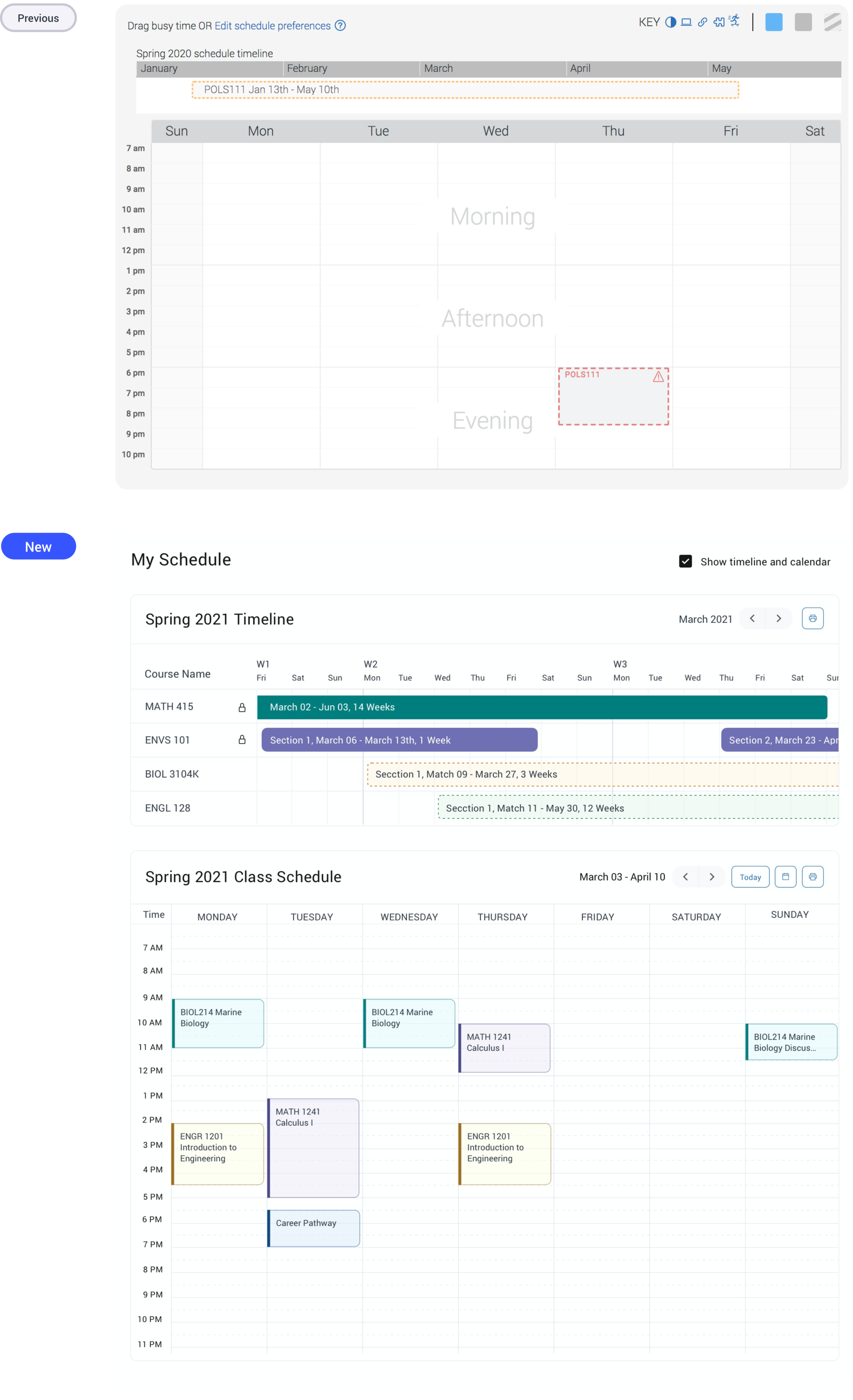
Students need a way to preview classes that run on the same dates together, even if they occur during different term types, to help them see an overarching view of concurrent courses.
Overwhelmed Course List
Students felt overwhelmed by the number of categories and action options in the requirements tree. They preferred the simplicity and clarity of the term by term planning suggestions.
Revisit Advisor's Plan
Students were very positive about receiving deep, individualized feedback from advisors about their academic plan.
01
Overview Dashboard
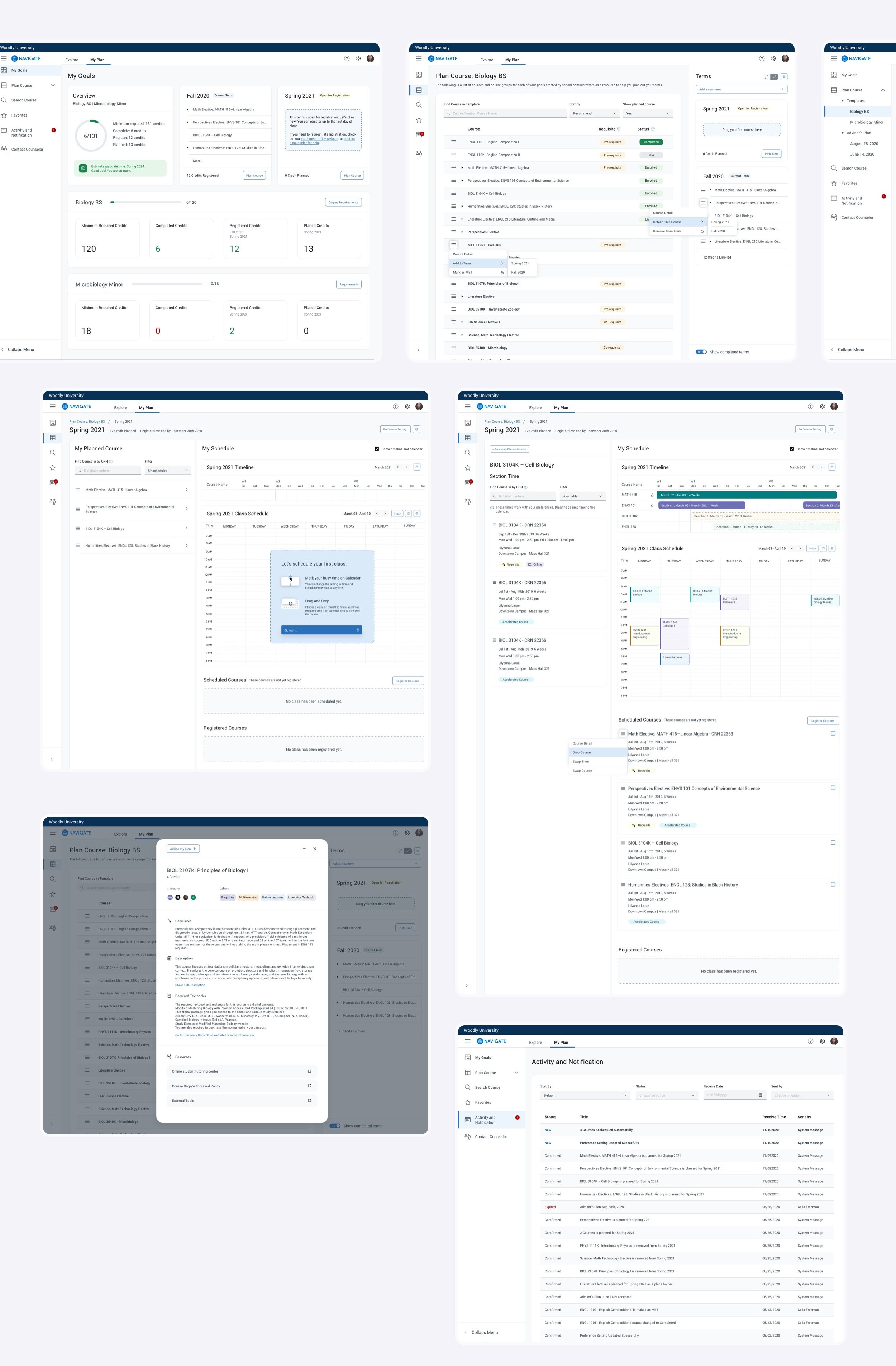
Add one brand new page as the ‘dashboard’ at the beginning of the flow. It gives students a bigger picture of their academic progress. .
02
Reorganize Navigation
03
Labels
04
Course Details
05
Activity and Notification
This page keeps all the notification in one place, and users can revisit them at any time. It includes user activities, system notifications, advisor’s actions and advisor’s notes.
06
Timeline and Calendar
07
New Options in Menu
As students’ feedback, we add four new functions in the product, which is Retake This Course, Drop Course, Swap Time, Swap Course. It will save tons of time for students.

Credits
Design
Keith Vejvoda
Shelley DeLucia
Development
Tom Nguyen
Shahul Hameed
Product Management
Chris Johnson
From Idea to MVP Interface


