Design System
I had the opportunity to contribute to the HIP Design System from 2017 to 2020. While the system is continuously growing and evolving, here's a snapshot of how it looked like at the end of this year.
Our Goals
Create powerful, user-friendly web applications for data-centric interfaces.
The Human Interface Language (HIL) & Application Hosting Portal (AHP) framework allows for Rapid Application Development of User Interfaces. HIL accelerates development by providing a catalog of Prefabricated Interfaces and a streamlined API for data ingestion and transformation. AHP framework supports orchestrating the management of a set of Views to define a single product (i.e., application).
Plug-and-play Components that speed UI/UX development
Composable and reusable CSS modules that establish consistent design
A data- first API supporting rapid application development
Solutions developed to accommodate a broad range of user needs to translate into a richer online experience for all users
Components
Patterns
Icons
O1 Foundation
01.1 Core Color
We divided the colors into different categories for ease of use and systematization. We have assigned a self-name to each color for proper understanding within the team during the discussion.
Usage
Analysis of main contrast
We searched the central contrast combination between blue, grey, and white colors, trying not to back down the brand color palette and pass WCAG 2.00 standards.
01.2 Typography
Typography is the essential medium of communication between interface and users, especially for assessable product. A clear and straightforward guideline around text usage is the key to the success of accessibility design.
01.3 Spacing
01.4 Level
Example of Typography Combination and Spacing
01.5 Icon
02 Components
Components are one of the fundamental building blocks of the design system. Each component has been designed and coded to solve a specific UI problem. We've created 112 components in this library. Here are some examples below.
02.1 Button
02.1.1 Primary Button
Use the primary button to pay the user's attention to the main actions on the page. Place this button only once per screen.
02.1.2 Secondary Button
If the actions are not included in primary actions, use the secondary button. It can be used several times per screen as needed.
Sizes and Usage Examples
02.2 Input and Text Area
Use text input when the expected user input is a single line of text instead of a paragraph. Use the text area when the expected user input is more than one sentence.
02.3 Dropdown
02.3.1 Default
It allows the user to select one option from a list.
02.3.2 Multiselect
It allows the user to select multiple options from a list and filter.
02.3.3 Combo Box
It allows a user to enter any value or choose a value of a list of suggested, likely, or desired values.
Best Practices for Labels
Labels must be visible when an input gets focus.
Labels must be announced to the screen reader on focus.
Ensure the helper text that appears under an input is read when an assistive technology user stops at an input using ARIA.
02.4 Data Table
02.4.1 Default
The default data table comes with a base style with only the title, header, table elements, and rows.
02.4.2 With selection
Bulk actions are functions that may be performed on multiple items within a table. This type of table enables the user to select individual rows and apply an action. A bulk action toolbar appears when table rows are selected.
02.5 Notification
02.5.1 Line
Inline notifications show up in task flows to notify users of the status of an action. They usually appear at the top of the primary content area.
02.5.2 Growl
Growls are non-modal, time-based window elements used to display short messages; they typically appear at the top right of the screen and disappear after 6 seconds.
03 Pattern
Patterns are best practice solutions for how a user achieves a goal. They show reusable combinations of components and templates that address common user objectives with sequences and flows.
03.1 Global Navigation
03.1.1 External Product Header
Global header using in an external product must include the Branding Bar above.
03.1.2 Internal Product Header
Global header using in an internal product does not need to have the Branding Bar.
03.1.3 Left Panel
The left panel allows for more navigational items to stack vertically and an additional hierarchy level when paired with header navigation. Compared to header-only site navigation, this arrangement means sub-menus can remain open without overlaying or interfering with the page content.
03.2 Dialog
Use dialogs commonly for short and non-frequent tasks, such as editing or management tasks.
03.2.1 Standard
Must include a backdrop when to use.
03.2.2 Full-screen
For mobile screen usage only. No backdrop is needed.
When to use a dialog
Use to focus the user's attention.
Use for short task completion.
Use to gather input from the user.
Use to display relevant information.
Dialog Variants
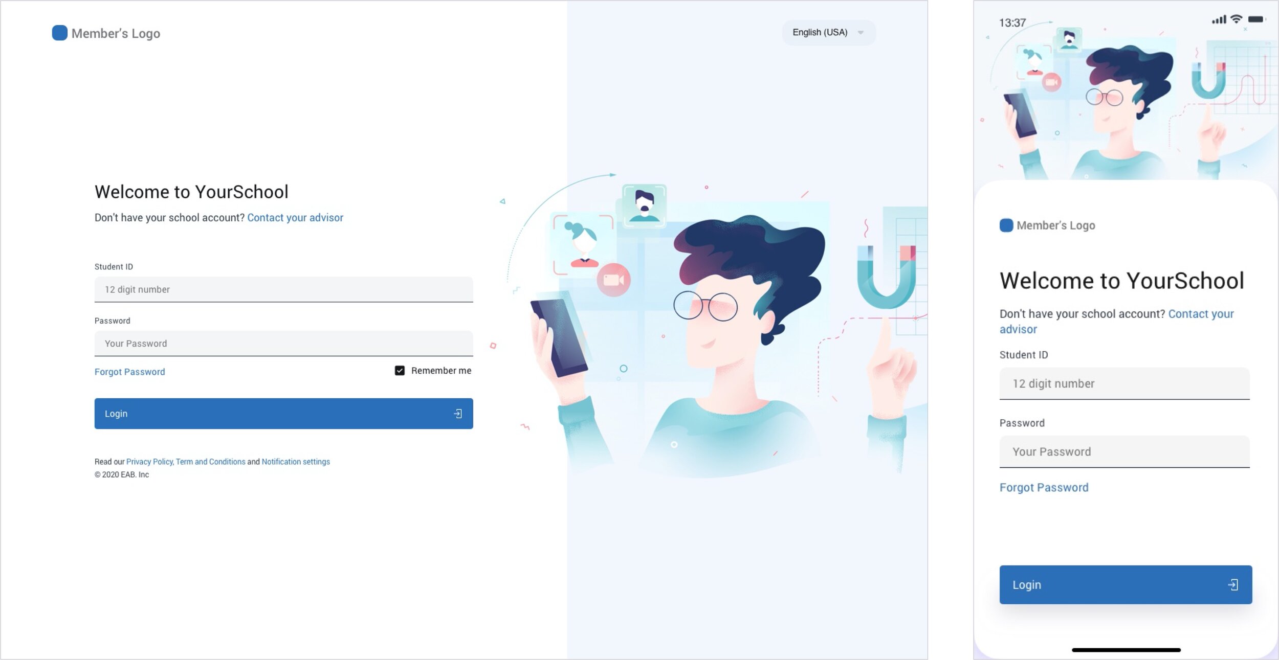
03.3 Login
03.4 Calendar and Timeline
Credit
Design
Keith Vejvod
Fabricio Torres-Rueda
Development
Michael Jaworski
Sravan kumar kachavarapu
Kishan Bhutiya
Lin Chen
Product Management
Keith Vejvod
Academic Planning Redesign


